")
Let’s be honest, we’ve all seen some seriously bad data visualizations. You know, the ones that make you squint, tilt your head, or just sit there wondering, “What the heck am I even looking at?”
Bad charts aren’t just ugly. They’re misleading, confusing, and sometimes downright dangerous. And with so many businesses relying on data to make smart decisions, bad visuals can lead to poor judgment, wasted money, or even a damaged reputation.
So, if you’re tired of overcomplicated bar charts, exploding pie slices, or line graphs that look like spaghetti… you’re in the right place.
This post will walk you through real-world bad data visualization examples, explain why they fail, and more importantly how to fix them.
Let’s dive in.
Why Bad Data Visualizations Are a Big Deal
Before we start calling out bad design, let’s clarify: Why does it even matter?
Because Data Tells a Story and Visuals Are the Punchline
Data alone is just numbers. Visualization is what turns it into meaning. But bad visuals? They twist the story. That’s like reading a book where the chapters are out of order frustrating and confusing.
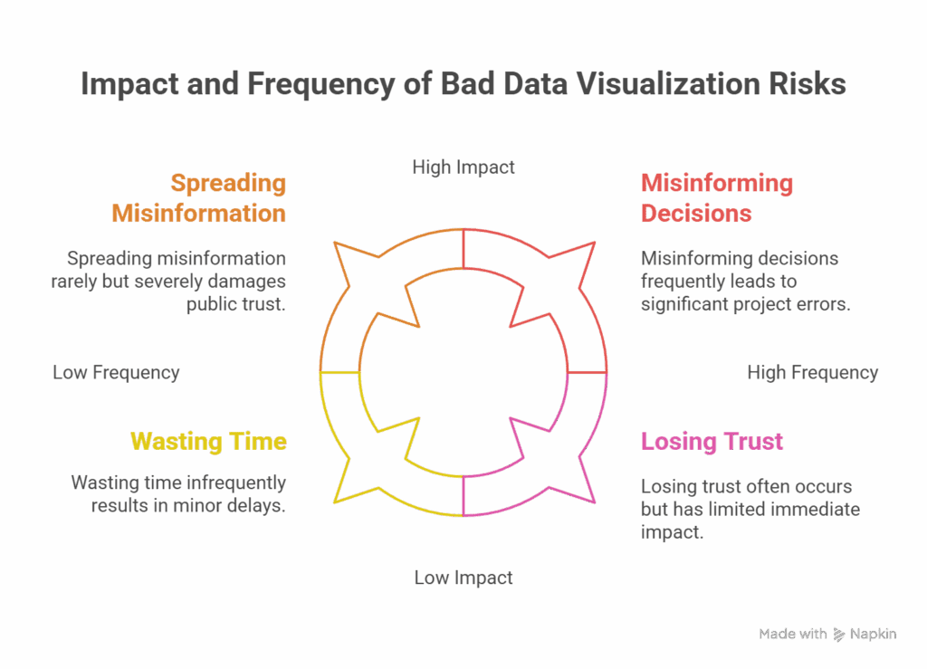
The Risks of Bad Data Visualization
- Misinforming Decisions: Stakeholders rely on charts to take action. One misleading graph can send a project in the wrong direction.
- Wasting Time: Confusing visuals mean more time spent interpreting and clarifying.
- Losing Trust: Your audience may stop taking your reports seriously.
- Spreading Misinformation: In public-facing media, bad visuals can go viral for all the wrong reasons.
Here’s a stat to back it up:
85% of decision-makers say visual storytelling is key to understanding data, but 73% admit they’ve misunderstood a chart at least once.
Source: Accenture Research, 2024
Top 10+ Bad Data Visualization Examples (And What Went Wrong)
Let’s break down some epic fails in the data world — and what you can learn from them.
1. The Pie Chart That Ate Too Much
The Offender: Too Many Slices in a Pie Chart
Why It’s Bad:
- Pie charts are only good for comparing a few categories.
- When you have 10+ slices (especially with similar sizes), it becomes unreadable.
What To Do Instead:
- Use a bar chart. It’s easier to read and compare.
2. 3D Charts That Add Confusion, Not Clarity
The Offender: 3D Bar Charts
You might think 3D makes your chart look cool. But trust me — it doesn’t.
Why It’s Bad:
- It distorts the actual height or length of bars.
- Makes it harder to compare values accurately.
- Shadows and depth skew perception.
What To Do Instead:
- Keep it simple. Flat, 2D charts are cleaner and easier to digest.
3. Misleading Y-Axis Scales
The Offender: Zoomed-In Y-Axis to Exaggerate Differences
| Year | Revenue (in $M) |
|---|---|
| 2022 | 95 |
| 2023 | 97 |
Now imagine a chart where the Y-axis starts at 90 instead of 0. Looks like revenue doubled, right? Wrong.
Why It’s Bad:
- The Y-axis starting point distorts visual perception.
- Viewers assume the visual difference matches actual difference.
What To Do Instead:
- Start Y-axis at zero unless you have a strong reason not to.
- Always label axes clearly.
4. The Rainbow Bar Chart (aka Color Chaos)
Color is powerful. But when every single bar in a chart is a different bright neon color, it becomes a visual disaster.
Why It’s Bad:
- Too many colors equal no visual hierarchy.
- Color should be used to highlight differences, not to decorate.
What To Do Instead:
- Stick to a single color family.
- Use contrast intentionally to draw attention.
5. The Exploding Pie Chart
Let’s face it — nobody likes getting slices of pie flung at them.
Why It’s Bad:
- Exploding slices disrupt the circular logic of a pie chart.
- It draws attention to the wrong data point — just because it’s pulled out.
What To Do Instead:
- Highlight slices with color or labels instead of explosion effects.
6. The Overlapping Line Graph
Ever seen a line graph with five or more lines all tangled together like spaghetti?
Why It’s Bad:
- Too many data series on one graph equals visual overload.
- Lines crossing everywhere = confusion.
What To Do Instead:
- Break it into multiple graphs.
- Use an interactive dashboard where viewers can toggle lines on or off.
7. Inconsistent Chart Types
Imagine combining a bar, pie, and scatter plot all in one just because you can.
Why It’s Bad:
- It’s hard to interpret.
- It doesn’t offer a unified message.
- Makes you look like you don’t understand your data.
What To Do Instead:
- Choose one clear visualization that matches the purpose of the data.
8. No Labels, No Legends = No Clue
You’d be surprised how many charts skip labels entirely.
Why It’s Bad:
- Viewers can’t interpret values or categories.
- Leaves too much room for misinterpretation.
What To Do Instead:
Always include:
- Axis labels
- Legends (if needed)
- Descriptive titles
- Clear data sources
9. Dual Y-Axes Disaster
Some charts use two vertical axes to show different units (such as sales and temperature). This can work, but often it doesn’t.
Why It’s Bad:
- It’s easy to misinterpret.
- The scales rarely align in a meaningful way.
What To Do Instead:
- Use separate charts or annotate correlations clearly.
10. Circular Bar Charts (Why Though?)
Bar charts are rectangular for a reason. Turning them into circles doesn’t improve anything — it just confuses everyone.
Why It’s Bad:
- Hard to compare lengths.
- Labels become awkward.
- Looks fancy, adds no value.
What To Do Instead:
- Stick to regular bar charts.
- If you want to get creative, use bullet charts or lollipop charts.
11. The Chart With Missing Context
Imagine a chart that shows “60% growth” — but doesn’t say what’s growing, over what time, or compared to what baseline.
Why It’s Bad:
- Viewers are left guessing.
- Could be intentionally deceptive.
What To Do Instead:
- Provide context: dates, comparison points, units, and sources.
Comparison Table: Good vs Bad Chart Practices
| Element | Bad Practice | Good Practice |
|---|---|---|
| Chart Type | Irrelevant or complex | Matches data and purpose |
| Color Use | Random rainbow palette | Limited, meaningful color use |
| Axis and Labels | Missing or misleading | Clear, labeled, consistent |
| 3D Effects | Used for decoration | Avoided unless absolutely necessary |
| Number of Data Series | Overcrowded | Simplified or interactive |
| Chart Clarity | Vague or busy | Easy to read and interpret |
| Context | Absent | Present: source, date, metric, etc. |
How to Avoid These Visualization Mistakes
1. Know Your Audience
- Are they technical? Use detailed visualizations.
- Are they executives? Keep it simple and big-picture.
2. Choose the Right Chart Type
| Purpose | Best Chart Type |
|---|---|
| Show proportions | Pie chart (maximum five slices) |
| Compare categories | Bar or column chart |
| Show trends over time | Line chart |
| Show distribution | Histogram or box plot |
| Show relationships | Scatter plot |
3. Use Clean, Consistent Design
- Stick to two or three colors max.
- Use readable fonts.
- Leave space for breathing.
4. Always Tell a Story
- What’s the takeaway?
- What should the viewer do with this information?
What Happens When Bad Visuals Go Public
You might think bad charts stay hidden in boardrooms, but they often end up on Twitter, Reddit, or LinkedIn — with thousands of people mocking them.
That’s not the kind of “viral” you want.
Final Thoughts: Bad Charts = Bad Business
Bad data visualization isn’t just an eyesore. It’s a liability. Whether you’re a marketer, data analyst, or CEO, clear visuals can make or break how your message lands.
So, next time you’re about to click “Insert Chart,” pause and ask:
“Will this actually help people understand the data, or just make them want to close the tab?”
Make the right call. Design visuals with purpose.
Need help building beautiful, actionable reports? Let the pros at Millionify handle your dashboards and business insights. Their expert team ensures your data is always telling the right story — without any messy pie slices.
FAQs About Bad Data Visualization Examples
1. What is the most common bad data visualization mistake?
The most common mistake is misleading axes — especially Y-axes that don’t start at zero. It exaggerates differences and misrepresents trends.
2. Can using too many colors in a chart be a bad thing?
Yes. It creates visual noise. Stick to a consistent color palette and use contrasting colors only to highlight key data points.
3. When should I avoid pie charts altogether?
Avoid them when:
- You have more than five categories
- The differences between values are small
- You want to compare items side-by-side
4. Why is 3D in charts discouraged?
3D distorts perception and makes it hard to interpret values accurately. It adds complexity without adding clarity.
5. What tools can help prevent bad visualizations?
Try:
- Tableau
- Power BI
- Looker Studio
- Flourish
- Datawrapper